SkyDemon has become one of the most popular tablet-based GPS solutions on the market but the update cycle to stay competitive is relentless and 2016 has been no different.
The challenge becomes retaining the clarity and ease of use that the software has become known for, while adding new features. Perhaps this is why one of the new features includes an in-app help menu instead of having to check on the website! Others are integrated functions that don’t impinge on the low-clutter display until you ask for them, such as tapping on a plotted leg to bring up extra details.
The mapping has been updated, integrating certain points of interest as well as getting a general refresh, which to me looked bright and clear. (With the added extra that a lot of the on-map features are the extraordinary number of castles around my part of the world, which are lots of fun to find from the air!)
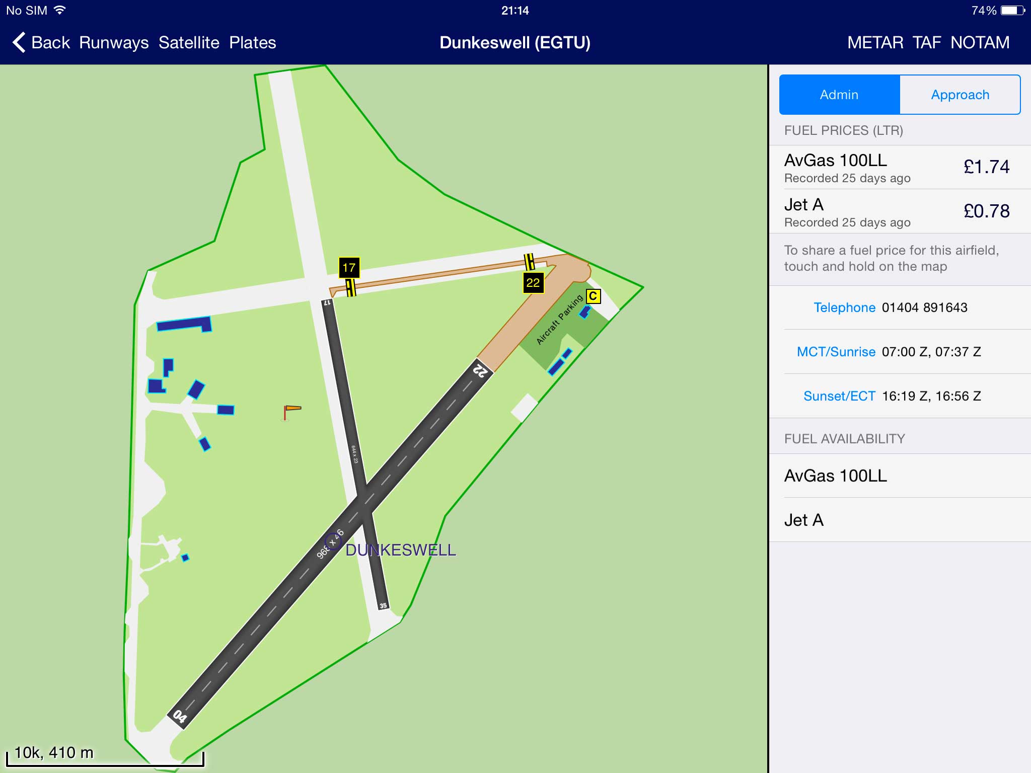
There is also now aerial/satellite photography available as a mapping option, something which was available previously for individual areas but not as an overview. Great for waypoint planning and finding details mentioned in noise abatement.
It’s also useful for identifying the airfield, although SkyDemon has gone one better here and added the option for a perspective view of the approach to an airfield for selected runways. This produces a Google Earth style look at the view down final. This is a clever addition, but except for approaches with particular gotchas, I’m not sure when I would use it in anger.

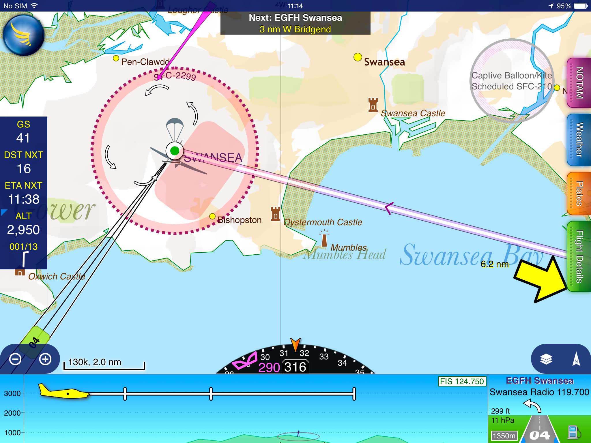
Also approach-related, and I would definitely use, is the new Airfield Brief panel that now pops up as a small cut-out in the bottom right corner as you get close to your destination. In additional to some basic info about elevation and radio frequency, the first thing you’ll notice is that the runway extended centrelines now have big runway number labels on them.
Selecting one of these with a long-tap will allow you to choose a circuit direction and join type. Be aware that, as the app prominently warns you, these options do not take account of any local rules and regs; they need to be used in conjunction with your normal flight-planning and flight guides for airfield info, overlaid in-app or otherwise!
Once you’ve selected a circuit and join you’ll see additional guidance on both the map and the Airfield Brief panel. Particularly for airfields which disallow overhead joins and the extra few minutes to orient yourself that these provide, I can see this being very useful at unfamiliar fields. Mind you, I do expect it to reignite the debate about lookout versus navigation versus the time saved from navigation for maintaining your lookout! For me, as I’m sure for many others at present, closing on the airfield is the cue to transfer attention away from the GPS until on the ground, so lookout and other pre-landing tasks while close to the airfield will need to be given some thought and attention if changing your normal workflow to incorporate new info.

Some other minor, handy improvements include colour-coded wind arrows, a slicker postcode database install and the ability, in the track log, to slide the aircraft along the route while looking at the details. Connectivity with PilotAware to overlay traffic is also supported and is likely to become more useful as the devices become more popular.
A more major change is support for split-screen multitasking on those iPads and versions of the operating system that support it. With the wide variety of other aviation apps for checklists, fuel management and so on, this has the potential to be useful. (Though the app I most commonly switch to while flying is the camera to grab a quick shot!) On the whole, most of the new features were useful without adding complexity and it will be interesting to see if, and how, split-screen functionality will find a niche in the flying workflow. Leia Fee
SkyDemon
NOTE: this review was first published in FLYER magazine June 2016 issue


