14 July 2026
Blackbushe Airport has revealed a fresh new look, but airport bosses are keen to stress that while the branding may be changing, its commitment to general aviation remains firmly the same.
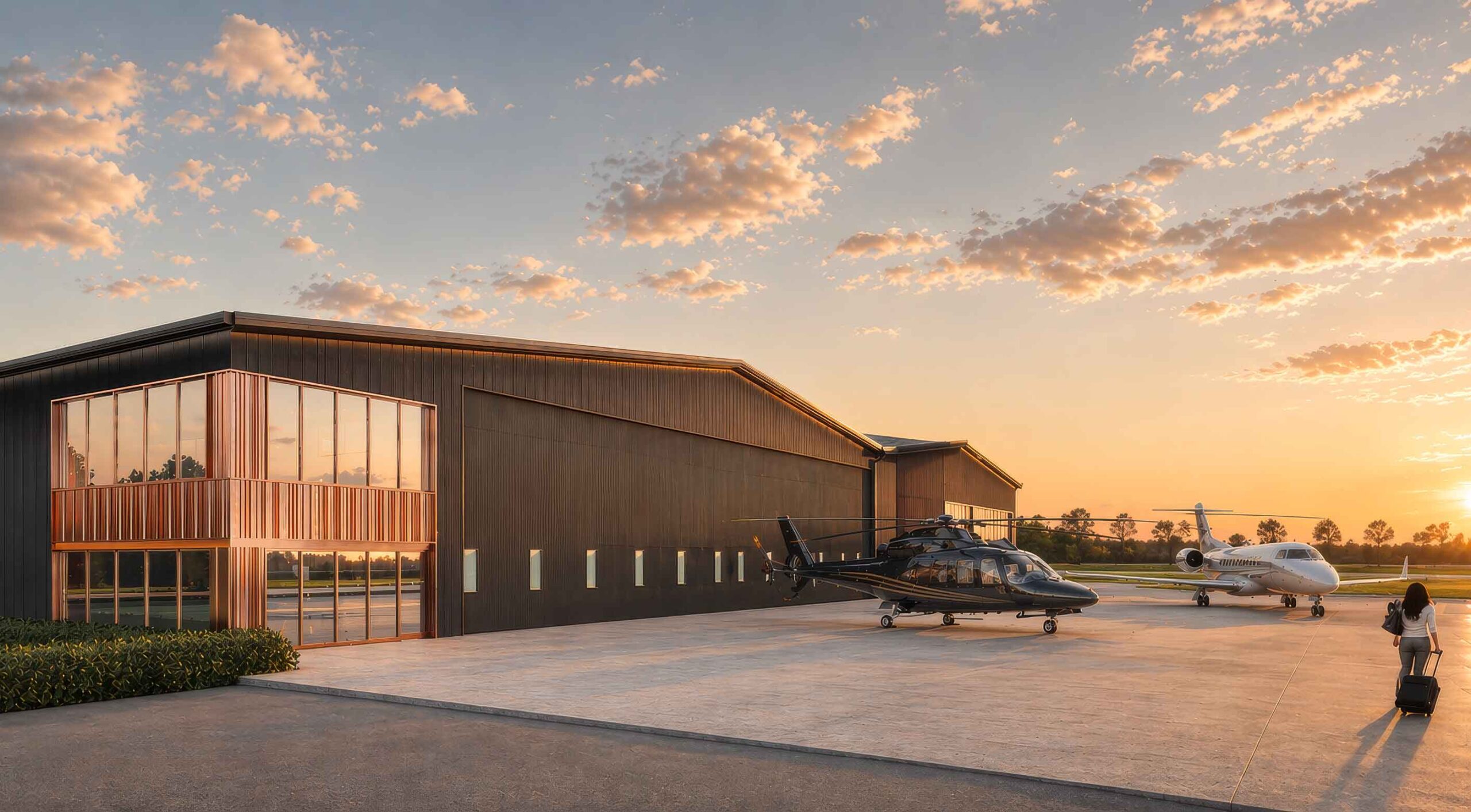
The Hampshire airport today unveiled a new visual identity as work continues on its ambitious redevelopment programme, including the construction of new hangars and wider investment that management describes as the biggest seen at Blackbushe for more than 60 years.
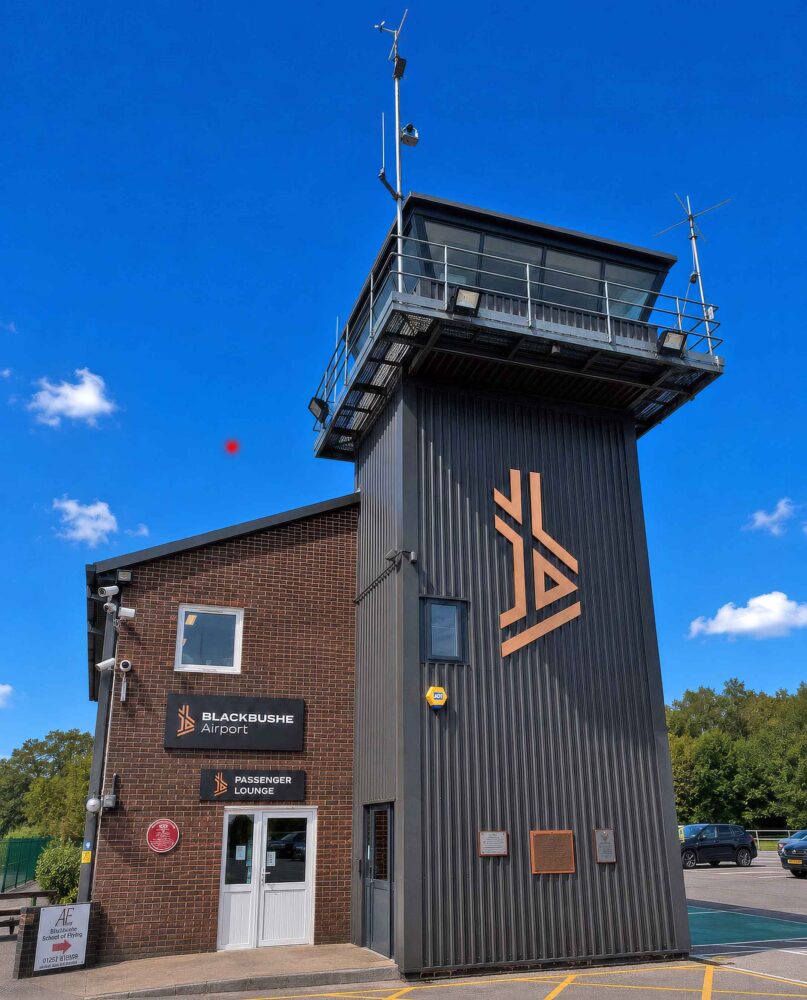
The rebrand also introduces Blackbushe Flight Training as the new name for the airport’s Approved Training Organisation, formerly Blackbushe Aviation, alongside refreshed identities for the Pathfinder Café, Airport Fire & Rescue Service and Air Traffic Service.
The timing is significant. Earlier this year, longstanding common land restrictions that had limited development at the airport for decades were finally resolved, paving the way for expansion. Construction of the first phase of new hangars is already under way, with completion expected by the end of 2026.
Chris Gazzard, Blackbushe Airport’s Managing Director, said the new branding reflects how the airport has evolved.
“The rebrand isn’t about changing who we are. It’s about making sure the airport’s identity reflects what Blackbushe has become,” he told FLYER.
“Over the past few years we’ve resolved planning hurdles and begun delivering the biggest programme of investment the airport has seen in more than sixty years. It felt like the right time for our identity to catch up with the progress that’s already underway.”
Pilots visiting the airport should notice little difference operationally.
“They’ll still receive the same friendly welcome, the same professional service and the same commitment to GA that Blackbushe has always been known for,” Gazzard added. “What they will see is a more consistent look across the airport, from our signage and facilities to Blackbushe Flight Training, the Pathfinder Café and our operational teams.”
The new logo itself is rooted in Blackbushe’s history. Its stylised “b” is based on the airfield’s original three-runway Second World War layout, while the copper and black colour scheme takes its inspiration from the cladding used on the airport’s new hangars.

Blackbushe has a remarkable history. Built as RAF Hartford Bridge in 1942 before becoming RAF Blackbushe, the airfield played an important role during WWII and later became one of Britain’s busiest civil airports.
During the 1950s it handled scheduled airline services before nearby Heathrow expanded into London’s primary international airport. Today, Blackbushe has reinvented itself as one of the UK’s busiest general aviation airports, handling more than 40,000 aircraft movements a year, from flying training and light aircraft to business jets including Pilatus PC-24, Cessna Citation and Gulfstream.
For Gazzard, the new branding is simply another milestone in a much bigger journey.
“Everything we’re doing, from our new hangars to our refreshed identity, is about creating a better airport for the people who fly here, while remaining true to the GA community that has always been at the heart of Blackbushe.”